Placeholder Pages
Placeholder pages fill a view with an image, a heading, and an optional line of descriptive text. They are used to fill a space that is empty but which would usually be populated with content.
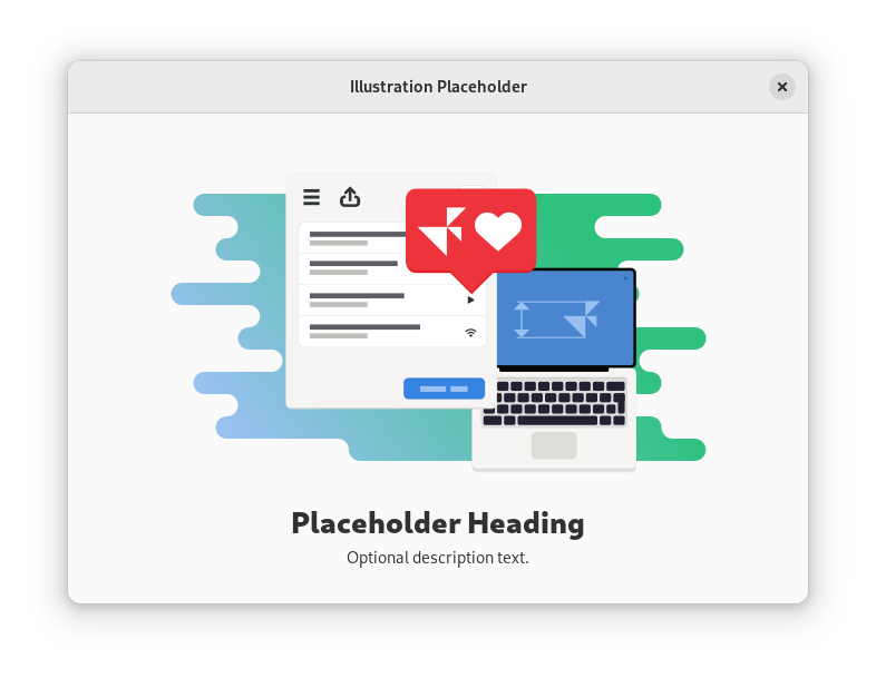
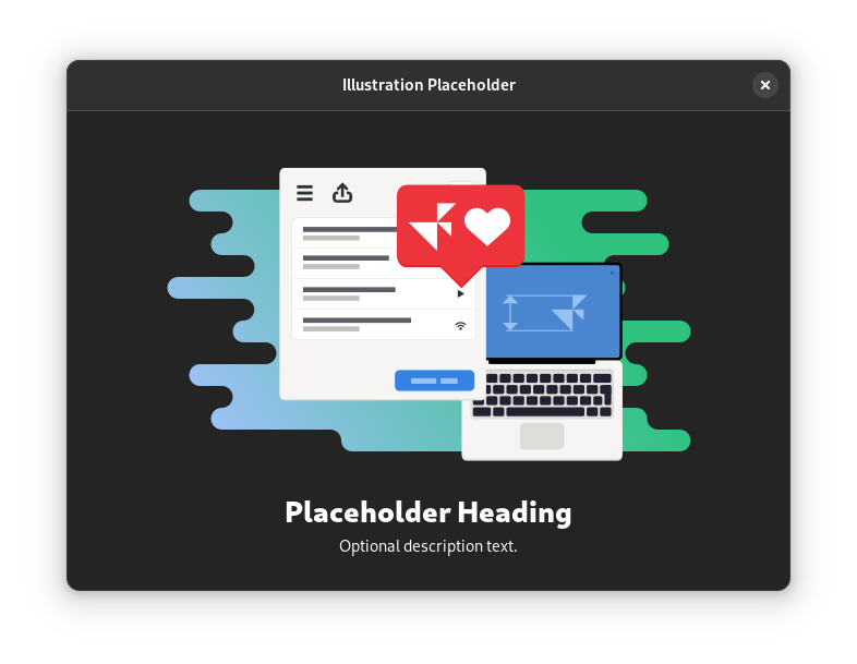
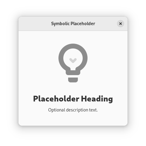
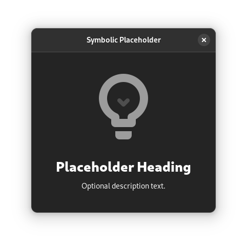
There are two styles of placeholder pages: illustration and symbolic. Illustration placeholders use a colorful graphic for the image, whereas symbolic placeholders use a simple monochrome icon.


When to Use
Placeholder pages with the illustration style are primarily used in the main view of an app, when it is empty. The main purpose of doing this is to avoid an awkward empty state when the app is first used. This type of placeholder can be a good way to provide guidance, set a positive note, and establish a relationship with the user.
However, placeholder pages should only be used for the initial view of an app when the initial empty state is unavoidable.
Symbolic placeholder pages should be used in other spaces that might often contain content, but which are empty, such as empty folders, albums or search results views.
Guidelines
All placeholders should include a heading which communicates the empty state and provides guidance. For example, “Empty Folder”.
It is often helpful to include a description which provides additional guidance, such as how to add items. For example, “Use the + button to add items.”
It can also be a good idea to include controls for relevant actions, such as adding content or starting a setup assistant. This is one place where the suggested button style can be appropriate.
If an illustration placeholder is used as part of the initial onboarding experience, the image should be rich and colorful, and the text should be positive and upbeat. This can also be an opportunity to strike up a relationship with the user by addressing them directly.
Symbolic placeholders should aim to be subtle and not attract undue attention. Use the default symbolic icon color and a neutral tone for the text.