Info Bars


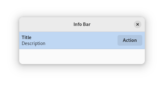
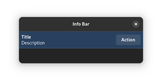
Info bars can be used to communicate persistent states. Examples include indicating that an app is offline, or that a document is read-only. In some situations, they can also be used to present supplementary information about special locations or content items.
When to Use
Info bars are more permanent than notifications and toasts. This makes them appropriate for communicating ongoing states which the user needs to be aware of, or location-specific information.
Info bars take up space and can be distracting. If the state you want to communicate is not critical, or can be communicated through a less disruptive label or icon, you might want to consider alternative ways to communicate the state in question.
Guidelines
Beware of info bar overuse: they should be an exceptional presence in your interface.
Only one info bar should be visible at any time.
Info bars should always have a heading.
Only include a longer explanation if it is really needed: a simple heading can sometimes be sufficient.
Generally speaking, info bars do not require an icon.
If an info bar is dismissible, use a close button using the
window-close-symbolicicon.Info bars can include buttons to provide additional actions relating to the state they describe. They should typically have no more than two of these.